Creative Luxury Cosmetic & Skin Care Packaging Design Services
04
05
06
07
08
Shop Home
09
Product Showcase
Welcome to IdeaHits, we specialise in providing creative luxury cosmetic and skin care packaging design services. Our team of experienced designers is committed to delivering innovative and visually stunning packaging solutions that are tailored to meet the unique needs of our clients.
At our company, we understand the importance of packaging in the beauty industry. A well-designed package can enhance the overall brand image and elevate the perceived value of the product. Our team is dedicated to creating packaging that not only looks beautiful but also serves its functional purpose, protecting the product inside and ensuring ease of use for the consumer.
We work closely with our clients to understand their specific requirements and brand identity. We believe that effective communication and collaboration is essential to producing successful packaging designs. Our team will work with you to create custom packaging that reflects your brand’s values, and meets the needs of your target audience.
Our design process is highly iterative, allowing us to incorporate feedback from our clients at every stage of development. We begin with concept sketches and progress through to 3D modelling and prototyping, ensuring that the final product is both aesthetically pleasing and functional.
We specialise in a range of luxury packaging materials, including glass, plastic, and metal, as well as incorporating sustainable and Eco-friendly materials where possible. We understand the importance of sustainability and strive to provide innovative packaging solutions that are both beautiful and environmentally responsible.
At our company, we pride ourselves on delivering exceptional customer service and on-time delivery of high-quality packaging. We understand the value of time and strive to deliver designs that meet our clients’ timelines and budgets.
Thank you for considering our services. We are confident that our creative luxury cosmetic and skin care packaging design services can help you create packaging that not only looks stunning but also enhances the perceived value of your brand. Contact us today to learn more and get started on your packaging design journey.
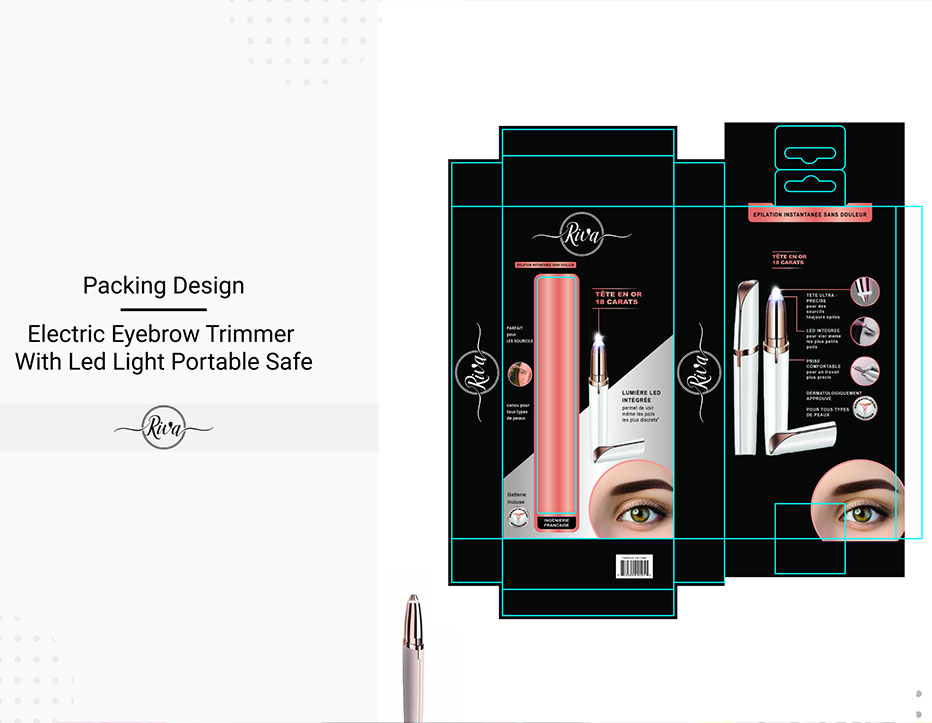
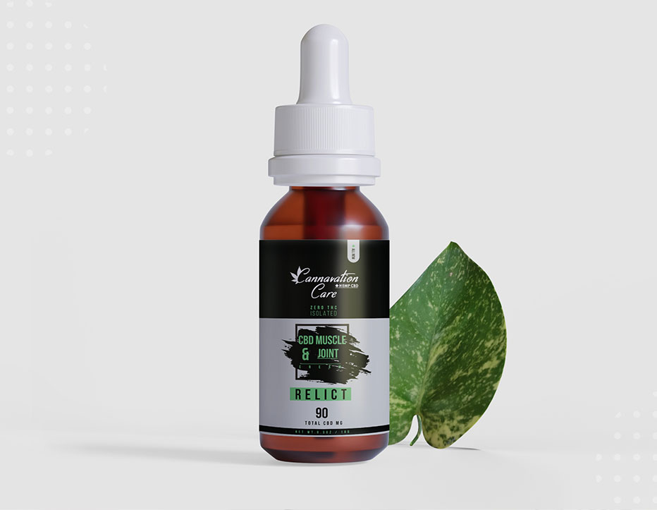

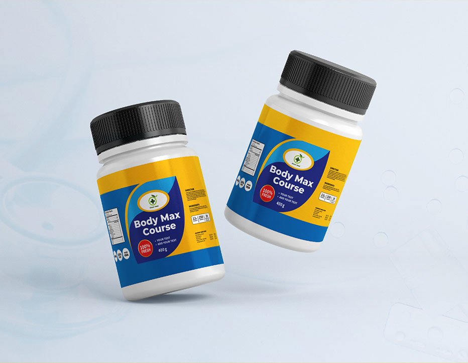
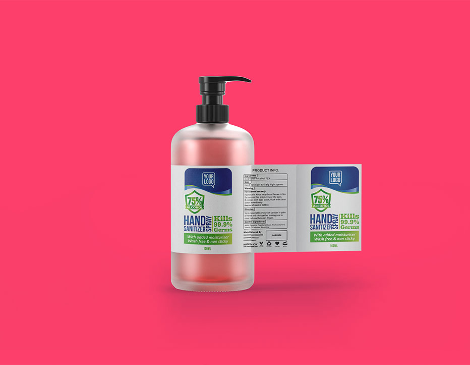

Creative Cosmetic Packaging Design
What is Luxury Cosmetic Packaging Design?
Luxury cosmetic packaging design is a type of design that is used to create a premium, high-end look and feel for cosmetic products. This type of packaging is often associated with high-end brands and luxury products, and is intended to convey a sense of sophistication, elegance, and exclusivity.
Luxury cosmetic packaging design often features high-quality materials, such as heavy glass jars, sleek metallic finishes, and soft-touch coatings. The packaging may also include ornate details, such as embossed logos, intricate patterns, or metallic foils, which add a sense of depth and texture to the design.
The color palette used in luxury cosmetic packaging design is often muted and understated, with a focus on neutrals, metallics, and deep, rich shades. The typography is typically simple and clean, with sans-serif fonts and bold lettering that conveys a sense of modernity and luxury.
The overall effect of luxury cosmetic packaging design is to create a design that is visually striking, elegant, and memorable. The packaging is designed to catch the eye and stand out on store shelves, conveying a sense of exclusivity and premium quality that sets the product apart from others in the market. Luxury cosmetic packaging design is an important element in creating a successful and recognizable brand image, and is often a key factor in the success of high-end beauty brands.
How To Design Luxury Cosmetic Packaging That Sells
Designing luxury cosmetic packaging that sells requires a combination of aesthetic appeal, practicality, and brand identity. Here are some key steps to keep in mind when designing luxury cosmetic packaging:
- Identify Your Target Audience: Before designing luxury cosmetic packaging, it’s important to understand the target audience for the product. This includes considering their preferences in terms of colors, textures, and packaging design.
- Create a Strong Brand Identity: Luxury cosmetic packaging should reflect the brand identity, values, and messaging. Use a consistent color scheme, typography, and visual elements across all packaging to create a cohesive and memorable brand image.
- Focus on Aesthetics: Luxury cosmetic packaging must be visually striking and unique. Use high-quality materials, such as heavy glass jars or sleek metallic finishes, to create a premium look and feel. Consider adding intricate details, such as embossed logos or metallic foils, to create a sense of depth and texture to the design.
- Ensure Practicality: Luxury cosmetic packaging must be functional as well as beautiful. Ensure that the packaging is easy to use, and that it protects the product during transportation and storage.
- Consider Sustainability: Luxury cosmetic packaging can be made sustainable by using recyclable or biodegradable materials. This can not only help the environment but also enhance the brand’s image and appeal.
- Create a Memorable Unboxing Experience: Luxury cosmetic packaging should create a memorable unboxing experience that adds to the overall appeal of the product. Consider adding a personalized note or a small gift to enhance the customer’s experience.
Designing luxury cosmetic packaging that sells requires a balance of aesthetic appeal, practicality, and brand identity. With a focus on these key elements, it’s possible to create packaging that not only looks beautiful but also enhances the value and appeal of the product.
Luxury Cosmetic Packaging Design Examples
Do you want to get inspiration for luxury packaging design? Here are some luxury packaging design examples.
Lancome
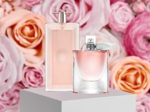 Lancome is a well-known beauty brand that is synonymous with luxury and elegance. The packaging design of their products is no exception, with a focus on sleek lines, rich textures, and bold typography that immediately catches the eye.
One of the standout features of Lancome’s packaging design is the use of high-quality materials. The brand often uses heavy glass jars, shimmering metallic finishes, and soft-touch coatings to create a premium look and feel. The weight and heft of the packaging are immediately noticeable, giving the products a substantial and luxurious feel in the hand.
The colour scheme of Lancome’s packaging design is also a major point of appeal. The brand often uses deep jewel tones, such as emerald green and sapphire blue, to create a sense of opulence and luxury. These bold colours are paired with crisp, clean white or black typography that pops against the rich background, making for a striking and memorable design.
Another element that sets Lancome’s packaging design apart is the attention to detail. From the embossed logos to the intricate patterns etched into the glass, each product feels like a work of art. The typography is also carefully chosen and placed, with elegant serifs and clean lines that reinforce the brand’s reputation for sophistication.
Overall, Lancome’s luxury packaging design is a masterclass in high-end branding. The combination of premium materials, bold colors, and intricate details creates a memorable and compelling design that immediately communicates the brand’s values of elegance, quality, and luxury. Whether you’re looking for skincare, makeup, or fragrance products, Lancome’s packaging design is sure to catch your eye and make a lasting impression.
Nars
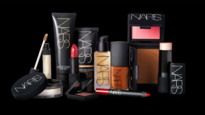 The website of the luxury cosmetic brand Nars tells everything about them. It provides a range of beauty products. The packaging of the products tells us that it is luxury packaging. Leading provider of lasting beauty items in the market is Nars.
Its latest 18-piece line of lip products, eye shadow palettes, and blush hues is available in a limited edition that bears Claudette Augustine, the mother of François Nars, as its moniker.
The company’s new luxury cosmetic packaging design fits in perfectly with its emblem and the graphic crimson star, heart, and butterfly prints because it is a dark and moody brand.
This plain, minimalist style is incredibly alluring and has a distinctive flair that sets it apart from the competition. It has an enigmatic demeanour that won’t go away and is moody.
These psychedelic packaging designs for Nars cosmetics are guaranteed to attract attention.
Fenty Beauty
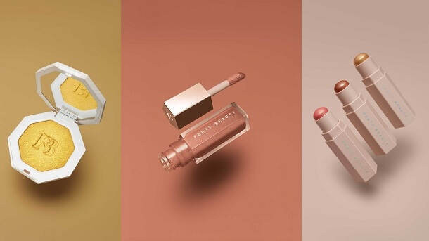 The new line of slide shine sheer shiny lipsticks from Rihanna’s well-known brand Fenty Beauty has innovative yet understated packaging.
These products’ shapes were played with by the brand, and their designs are notable primarily for the clever geometric shapes that make them stick out on the shelves.
These designs, which have an intriguing hexagonal shape and clean, bold typography that depicts the business logo, reflect Rihana’s personality, which is one of taking chances and pushing limits.
This high-end cosmetics packaging is comprehensive yet straightforward and understated. These goods have a soft, inviting feel thanks to their elegance and stylish appearance.
Mor
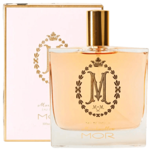 The website of the MorBoutique gives an impression of luxury and style. With its package design, Mor took a more conventional path, choosing luxury and refinement in its images, logo, and colour scheme.
With a large M crafted from a regal gold hue and written in a fancy, curly font, the Mor’s logo is present on all of its goods. Then a golden wreath that radiates elegance and grandeur surrounds this M.
But some of the more intricate design features on its other packaging have stood the weight of time.
There is certainly a floral theme going on here, whether we’re talking about the packaging or the logo. Many of the goods feature a floral pattern and design, and the packaging’s rich greens, delicate purples, and delicate pinks give it depth and an earthy feel.
These flowers are absolutely stunning and give this pattern a whole new level of majesty.
The packaging patterns for Mor’s cosmetics are exquisite and magnificent. The idea is that they don’t even resemble cosmetics.
SK-II
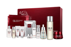 Limited version SKI-II Happy reunions of love, embraces, and kisses serve as the inspiration for XOXO PITERA facial treatment essence.
The red matte backdrop of this cosmetic packaging design highlights the brand’s vibrant logo with simple wording. This product may be the ideal present for the upcoming Valentine’s Day, according to the bold, gold typography that covers the entire packaging.
The luxury cosmetic packaging for the XOXO Pitera facial treatment essence honours love, which is why red predominates.
Laura Mercier
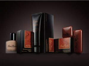 Laura Mercier is a beauty brand that is well-known for its emphasis on high-quality, natural ingredients and a minimalist, elegant aesthetic. The packaging design of their products is a reflection of this philosophy, with a focus on clean lines, soft colors, and simple typography that exudes luxury and sophistication.
One of the key features of Laura Mercier’s packaging design is the use of a warm, neutral color palette. The brand often uses soft creams, warm taupes, and light pinks to create a subtle, understated look that feels elegant and refined. These colors are paired with simple typography in a clean, sans-serif font that conveys a sense of modernity and sophistication.
Another element that sets Laura Mercier’s packaging design apart is the attention to detail. The brand often includes thoughtful touches, such as embossed logos and subtle patterns, that add a sense of depth and texture to the products. The use of high-quality materials, such as heavy glass jars and sleek metallic finishes, also reinforces the brand’s focus on quality and luxury.
In addition to the minimalist design, Laura Mercier’s packaging also emphasizes practicality and ease of use. The brand’s foundations, for example, come with an innovative pump that makes it easy to dispense just the right amount of product. The packaging design is not only aesthetically pleasing, but also functional, which adds value to the consumer experience.
Overall, Laura Mercier’s luxury packaging design is a masterclass in understated elegance. The combination of a warm, neutral color palette, simple typography, and thoughtful details creates a design that feels sophisticated, refined, and timeless. Whether you’re looking for skincare, makeup, or fragrance products, Laura Mercier’s packaging design is sure to catch your eye and make a lasting impression.
Charlotte Tilbury
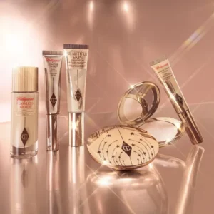 Charlotte Tilbury is a luxury beauty brand that is known for its glamorous, Hollywood-inspired aesthetic. The packaging design of their products is no exception, with a focus on opulent textures, bold colors, and ornate typography that immediately catches the eye.
One of the most striking features of Charlotte Tilbury’s packaging design is the use of rich, metallic finishes. The brand often uses shimmering golds, bronzes, and rose golds to create a sense of luxury and glamour. These metallics are paired with ornate typography that includes intricate flourishes and serifs, which add to the overall sense of opulence.
Another standout feature of Charlotte Tilbury’s packaging design is the attention to detail. From the gold foiled logos to the intricate patterns etched into the lipstick cases, each product feels like a work of art. The use of high-quality materials, such as heavy glass and smooth, soft-touch finishes, also reinforces the brand’s focus on quality and luxury.
The color scheme of Charlotte Tilbury’s packaging design is also a major point of appeal. The brand often uses deep, dramatic shades, such as rich burgundies and dark purples, to create a sense of drama and allure. These bold colors are paired with clean, simple typography in a sans-serif font, which creates a sense of modernity and sophistication.
Overall, Charlotte Tilbury’s luxury packaging design is a masterclass in old Hollywood glamour. The combination of rich metallic finishes, ornate typography, and attention to detail creates a design that feels decadent, luxurious, and theatrical. Whether you’re looking for skincare, makeup, or fragrance products, Charlotte Tilbury’s packaging design is sure to catch your eye and make a lasting impression.
Estée Lauder
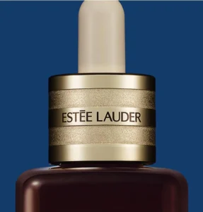 Estée Lauder is a legendary beauty brand that has been synonymous with luxury and elegance for decades. The packaging design of their products is a reflection of this legacy, with a focus on sleek lines, bold colors, and classic typography that exudes sophistication and glamour.
One of the key features of Estée Lauder’s packaging design is the use of a simple, yet striking color palette. The brand often uses sleek black or white backgrounds to create a sense of elegance and refinement. These colors are paired with bold typography in a clean, sans-serif font that conveys a sense of modernity and luxury.
Another element that sets Estée Lauder’s packaging design apart is the use of high-quality materials. The brand often uses heavy glass jars, shimmering metallic finishes, and soft-touch coatings to create a premium look and feel. The weight and heft of the packaging are immediately noticeable, giving the products a substantial and luxurious feel in the hand.
In addition to the minimalist design, Estée Lauder’s packaging also emphasizes practicality and ease of use. The brand’s foundations, for example, come with an innovative pump that makes it easy to dispense just the right amount of product. The packaging design is not only aesthetically pleasing, but also functional, which adds value to the consumer experience.
Overall, Estée Lauder’s luxury packaging design is a masterclass in timeless elegance. The combination of sleek lines, bold colours, and high-quality materials creates a design that feels sophisticated, refined, and classic. Whether you’re looking for skincare, makeup, or fragrance products, Estée Lauder’s packaging design is sure to catch your eye and make a lasting impression.

