Packaging design that feels shelf-ready, clear, and worth choosing.
A polished packaging and label design page with tactile product mockups, smooth portfolio scrolling, and practical calls to action.
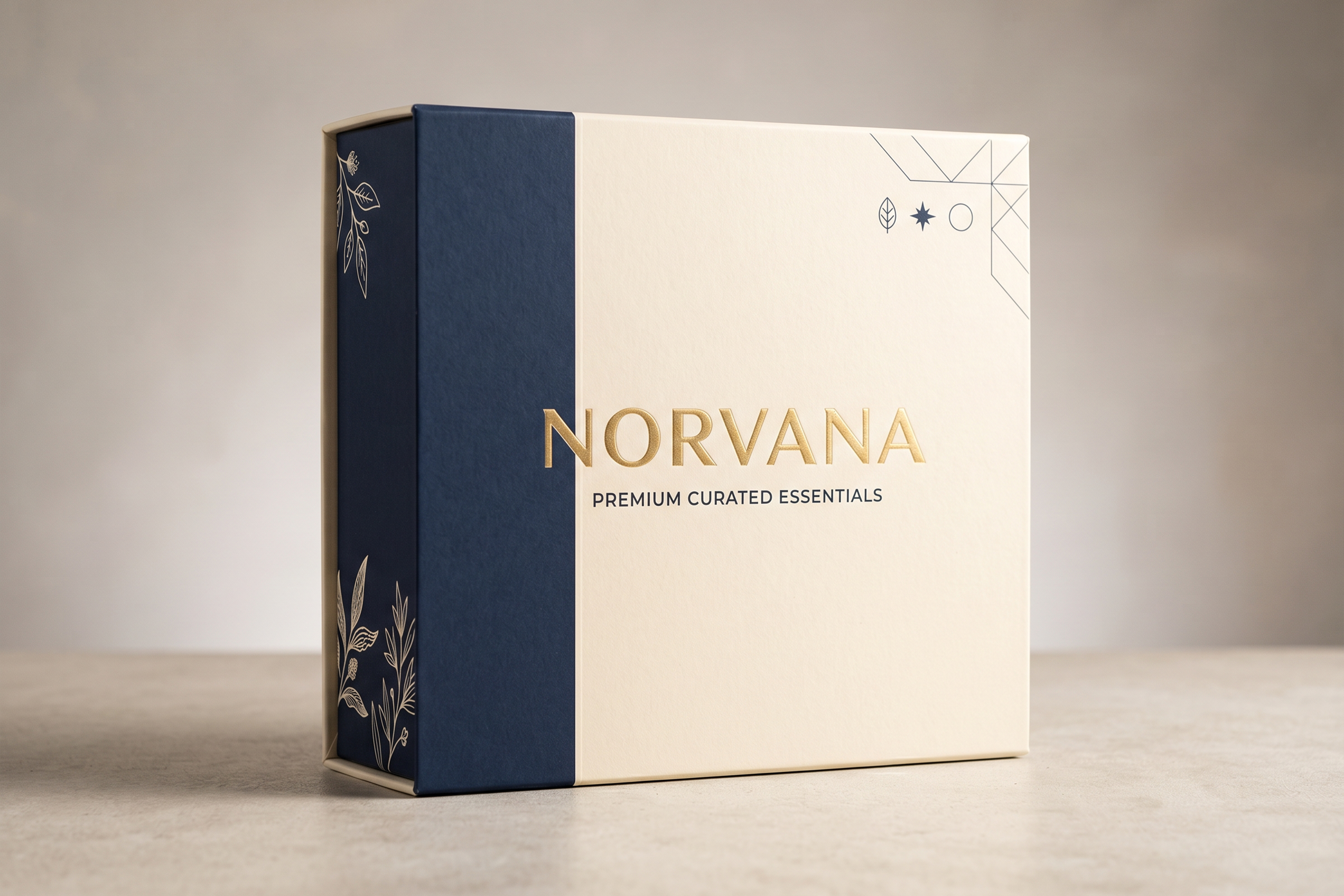
Wepairclearhierarchy,tactilemockups,andproduction-awarelayoutdecisionssoyourproductfeelsconsideredbeforeitisevenopened.
From product brief to shelf-ready packaging files
Map the product and buyer
We define the product promise, sales channel, must-read details, and what the pack needs to communicate first.
Design the pack direction
We build the front face, hierarchy, colour, mockups, and supporting panels around a clear product story.
Prepare launch files
You receive organised artwork, mockup previews, and production-ready exports for supplier or printer conversations.
Ready to get started? We handle everything from brief to print-ready files.
Start a packaging projectA tactile collection of packaging and label directions


Everything needed for a polished packaging launch
Product packaging support is kept practical: clear concept routes, realistic mockups, and files prepared for production conversations.
Product-facing concept
Pack mockup presentation
Production file setup
Product packaging has to earn attention fast.
The design should tell people what it is, why it matters, and why it feels worth choosing before they read every detail.
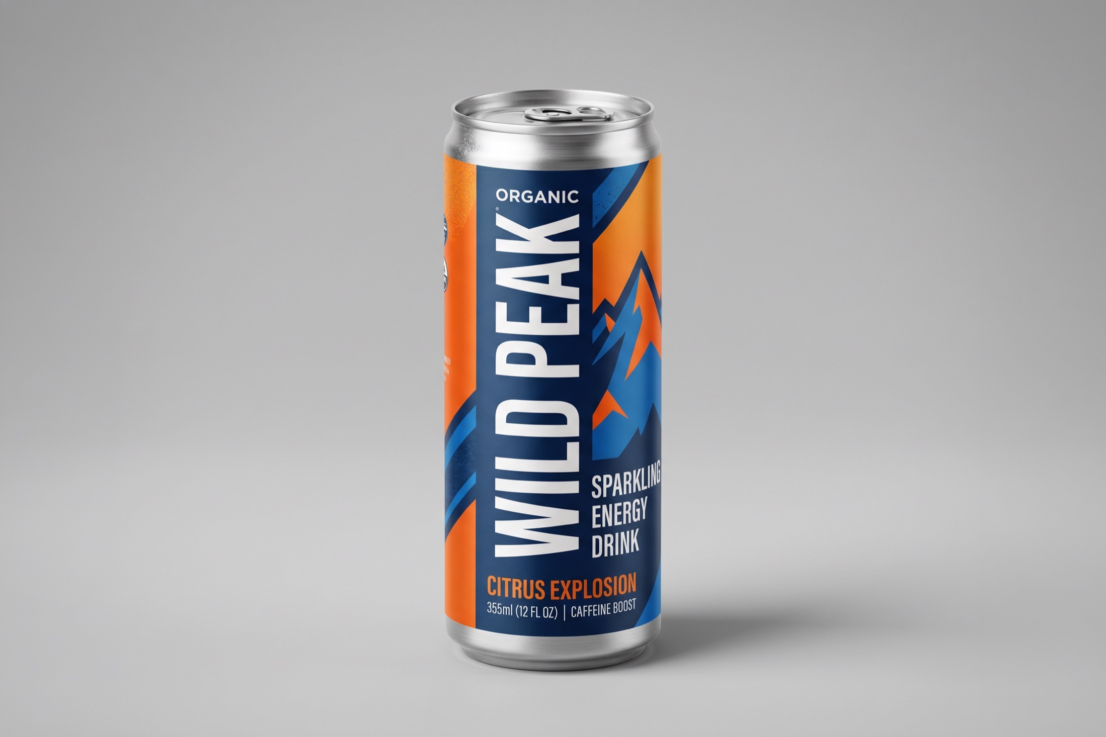
Series Showcase
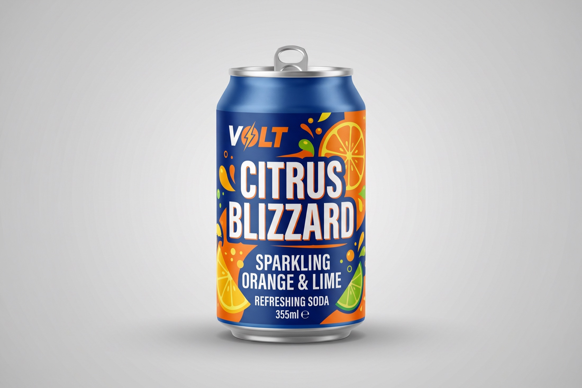
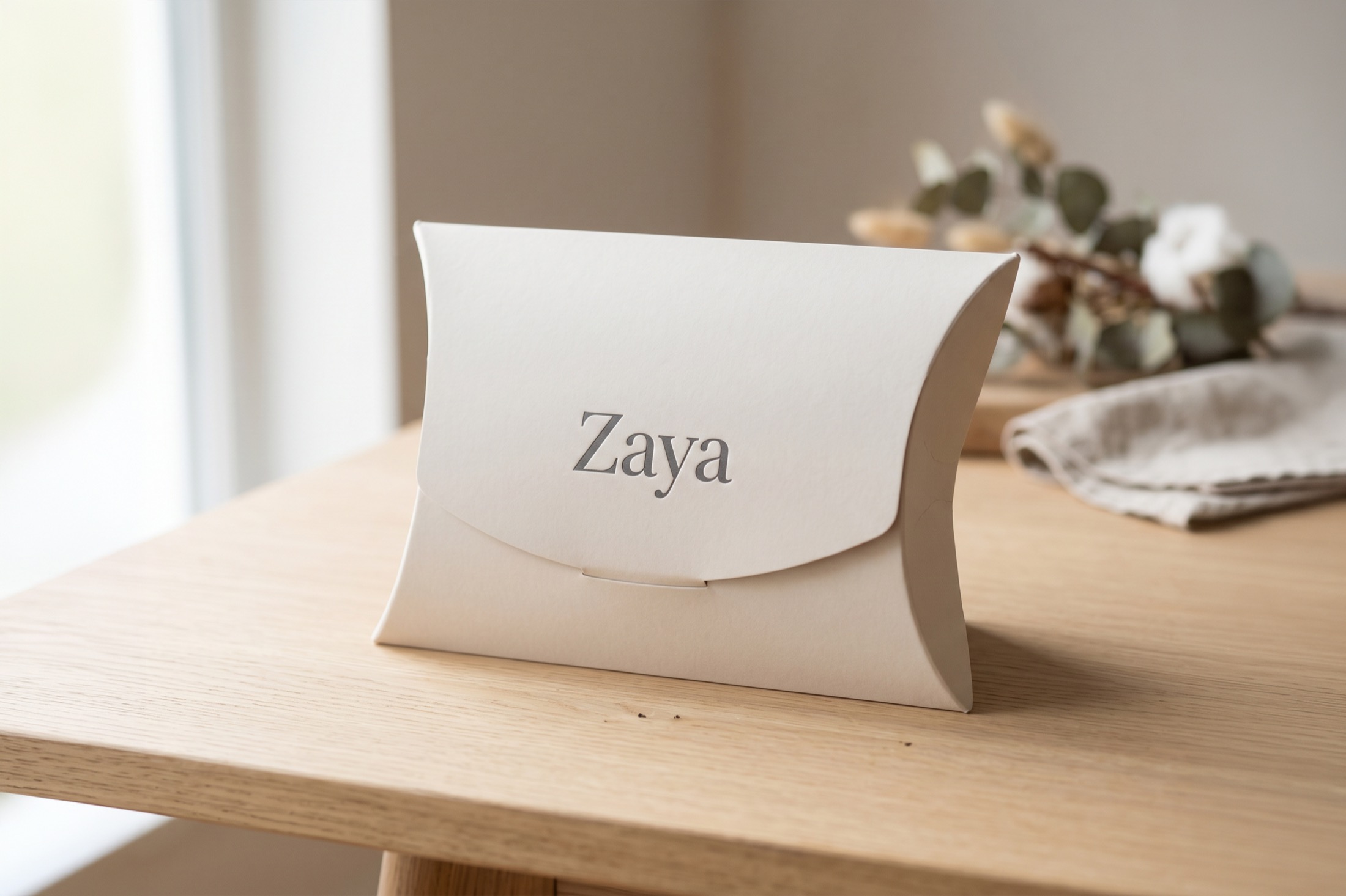
Clear product front
A strong first read for shelves, websites, and campaign thumbnails.
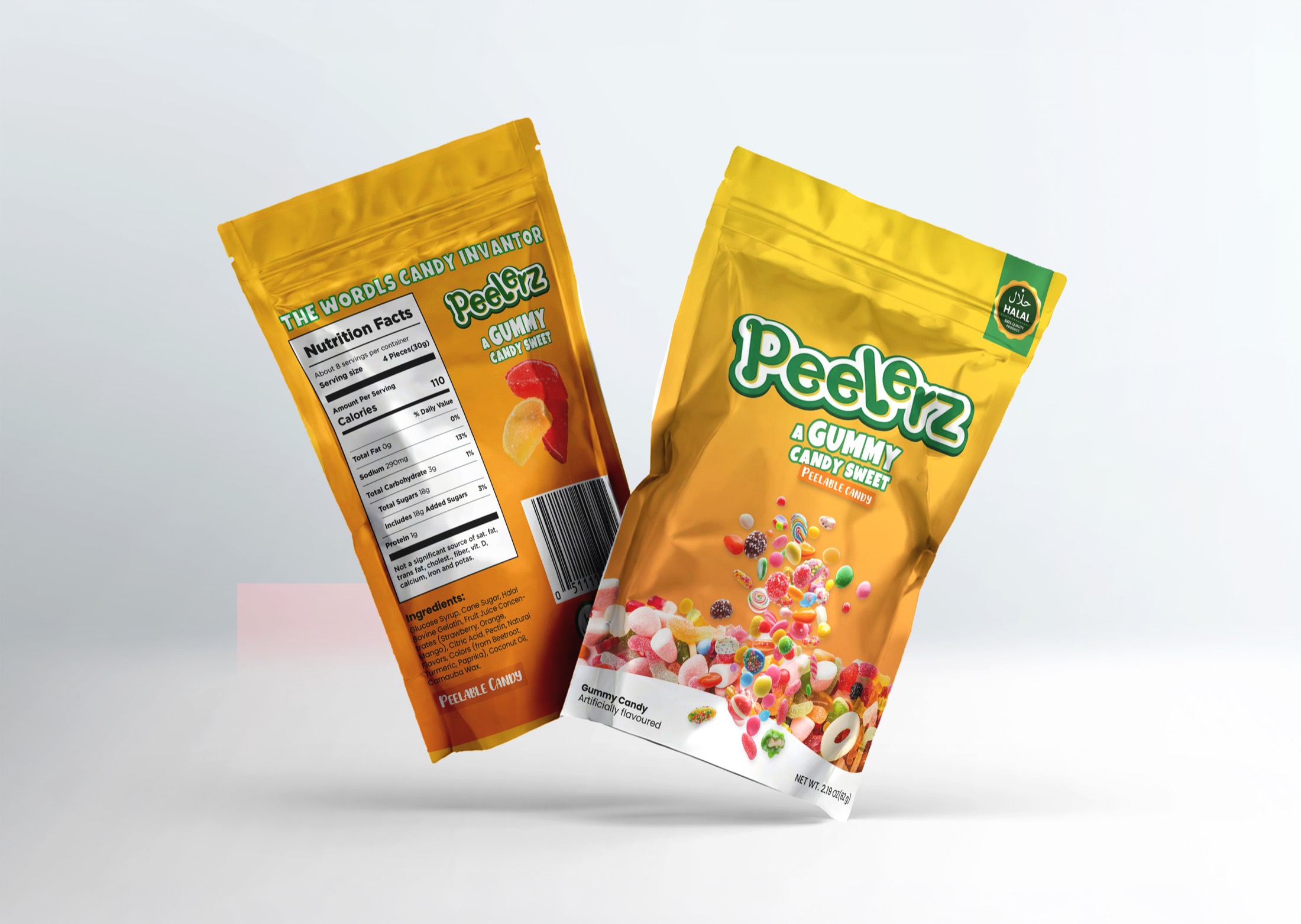
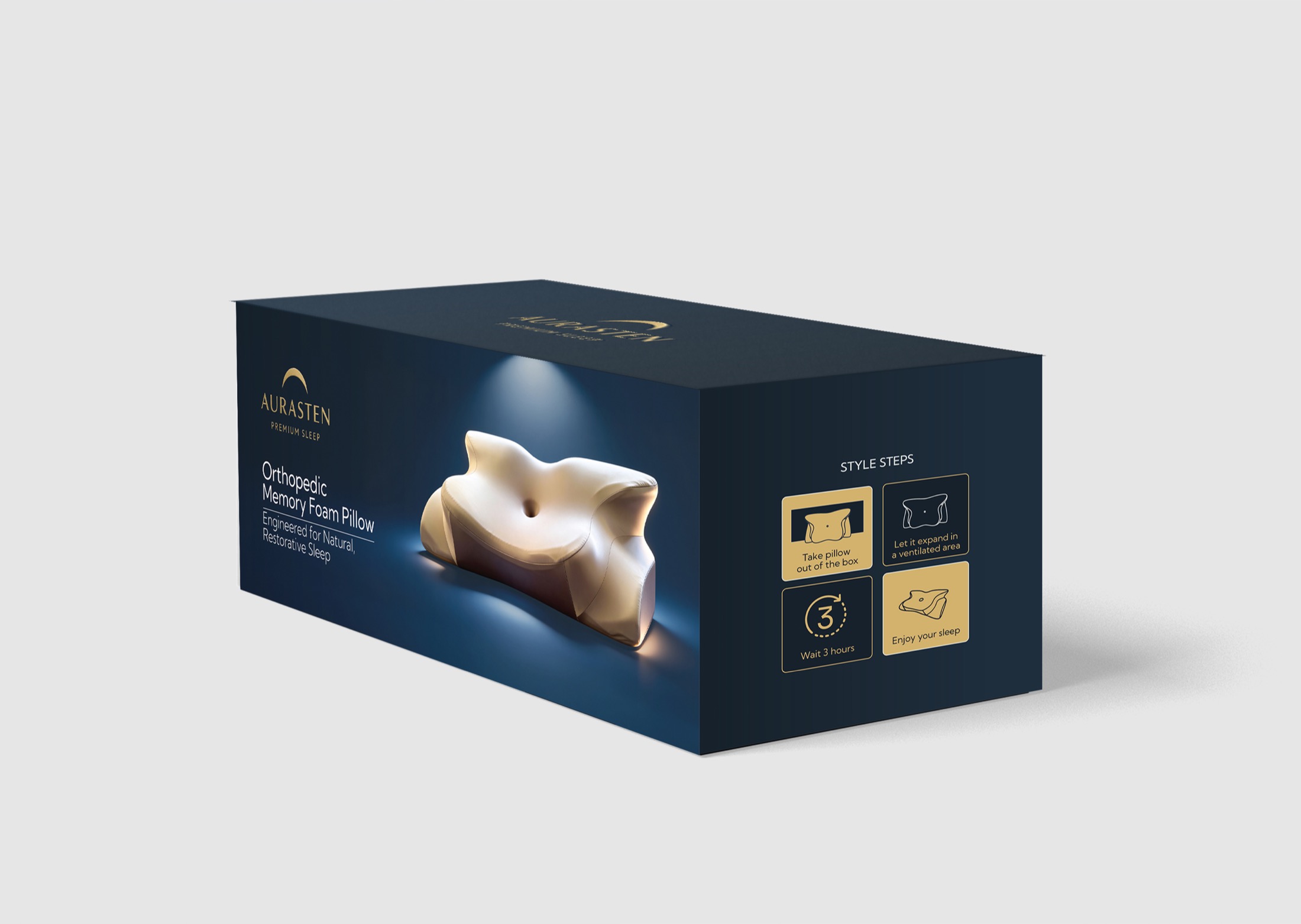
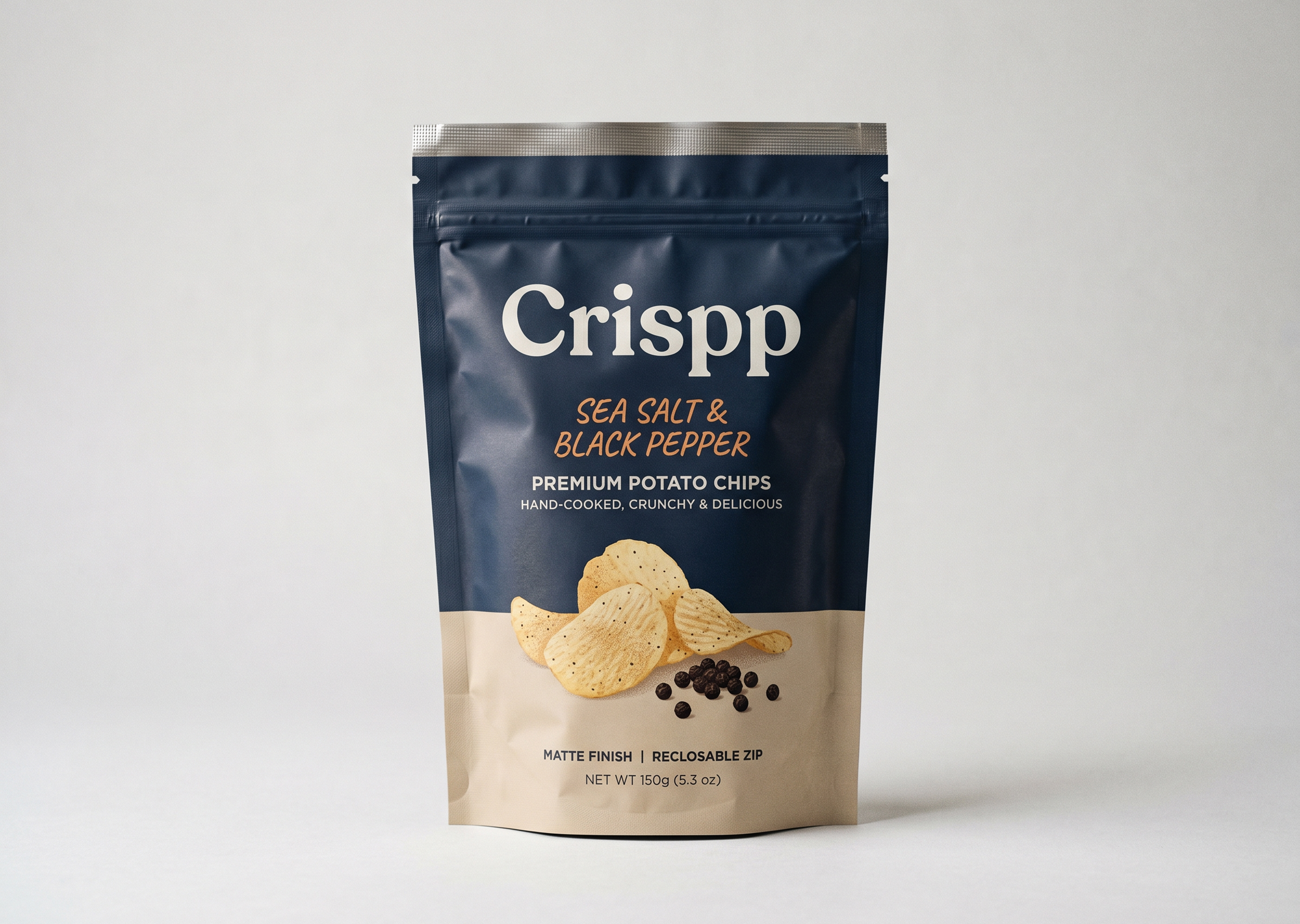
Complete packaging feel
A finished system across front, side, back, and supporting surfaces.
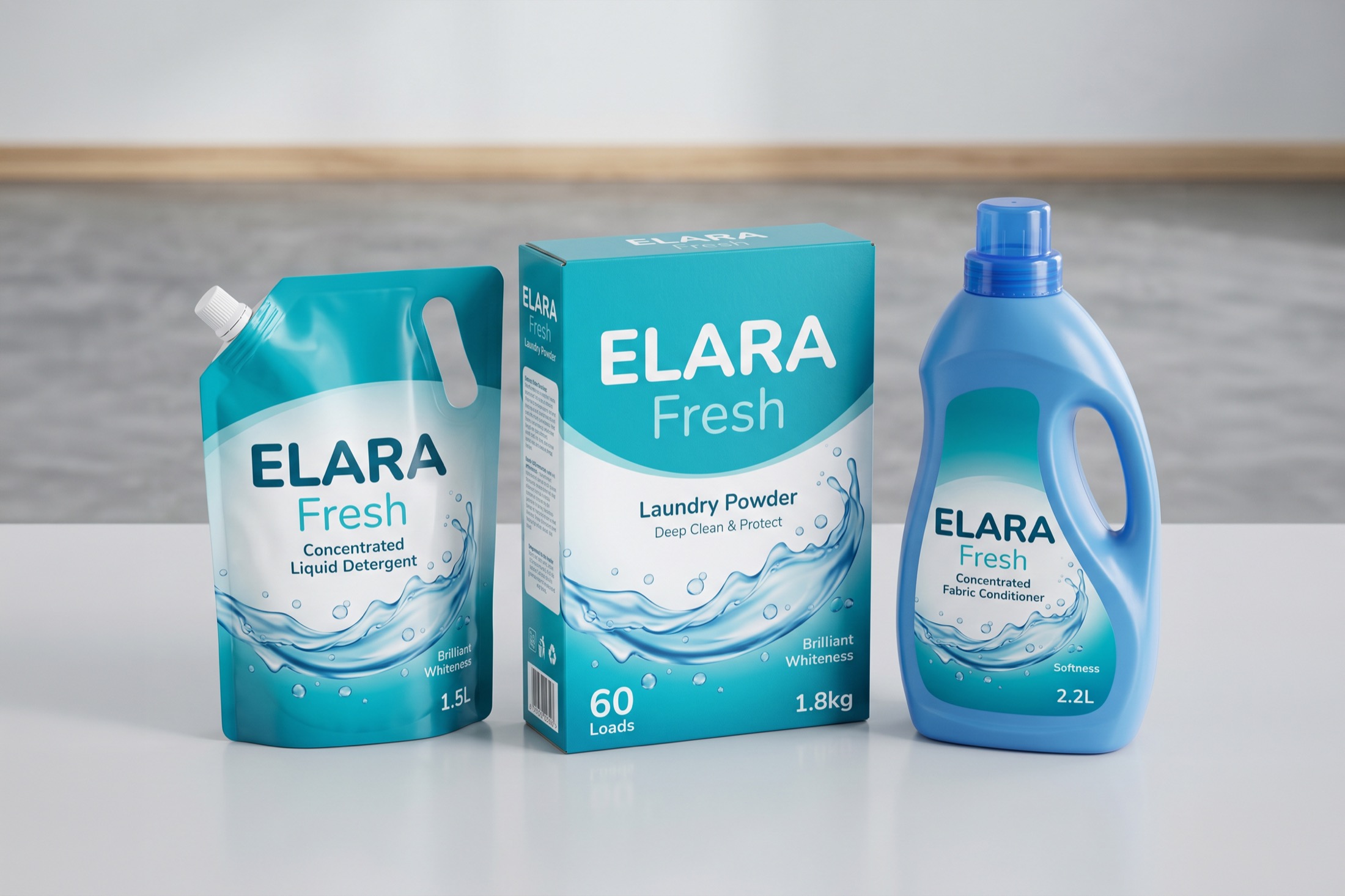
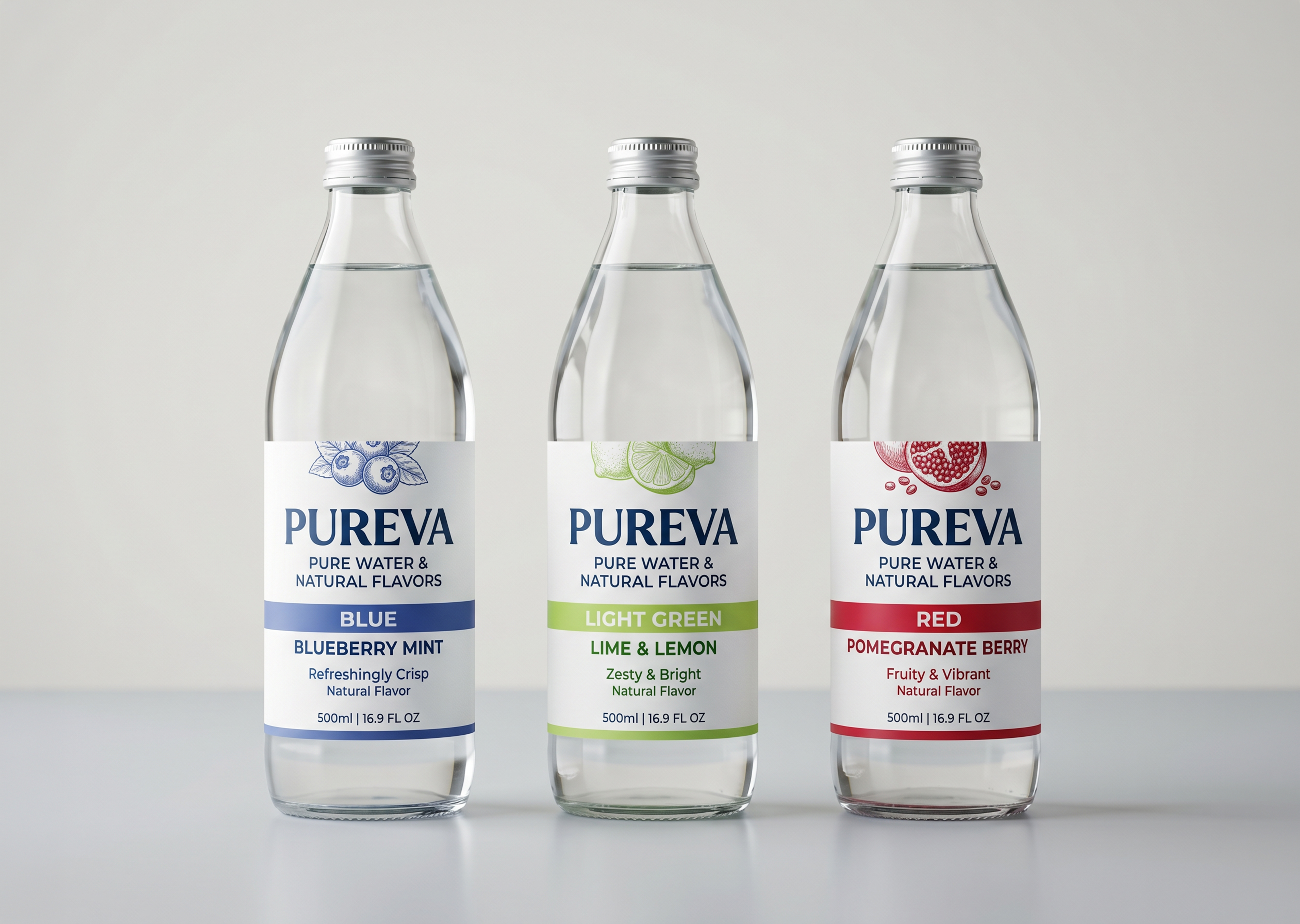
Scalable family logic
Consistent design rules for flavours, sizes, and product extensions.
Choose the level of product packaging support
Product face
Front panel · Hero label · EcommerceA focused packaging direction for the most visible product surface and thumbnail presentation.
Full pack
Box · Sleeve · PouchA complete packaging route covering the main pack face, support panels, and mockup presentation.
Product range
SKUs · Flavours · VariantsA scalable system for multiple products that need consistent structure and clear range logic.
Products that feel ready to buy
Product Packaging Design
Shelf-Ready Product Systems
Shelf presence. Every surface counts.
Every pack is built around a strong product face, clean information hierarchy, and enough visual confidence to work on shelf, in ecommerce thumbnails, and in the hand.